False Precip from Diurnal Tank Signal
As described above in the summary section, tank readings are never completely flat; there is variability in each measurement. Most of the time, the variation is within the precision of the sensor. However, some times, sensor electrical conditions and site heatinng create diurnal fluctuations, which have become large at some sites for periods of months (UPLO) or years (VARA).
There are many details to how these measurements are made. Precipitation Sensor Replacement Plan: Coefficient Calculation and Assessment of Past and Future Sensor Accuracy is the best resource on the topic.
Normal Diurnal Pattern (<1mm)
First let’s look at a normal diurnal range in tank measurements.
[1]:
# Jupyter magic to make plots display interactive
# must install ipympl (Ipython-matplotlib) and nodejs
from ipywidgets.embed import embed_minimal_html

%matplotlib ipympl

import pandas as pd
import matplotlib.pyplot as plt
from numpy import nan, arange

# expand all plots to comfortable viewing size
plt.rcParams['figure.figsize'] = [8, 5]

import sys
sys.path.append("../")
from post_gce_qc import qaqc, data_transfer, cross_probe_qc, main
[2]:
all_flags = main.main(2019, 2021, probes={'all_params'}, data_path='../config_new.yaml')
Loading all PPT data from ../config_new.yaml

Load data from VAR_02

All quality checks and quality assurance rules applied to VAR_02
------------------

Load data from UPL_01

All quality checks and quality assurance rules applied to UPL_01
------------------

Load data from UPL_02

All quality checks and quality assurance rules applied to UPL_02
------------------

Load data from CEN_01

All quality checks and quality assurance rules applied to CEN_01
------------------

Load data from CEN_02

All quality checks and quality assurance rules applied to CEN_02
------------------

Load data from CS2_02

All quality checks and quality assurance rules applied to CS2_02
------------------
[3]:
strt, end = pd.to_datetime('5/31/2020 0600'), pd.to_datetime('6/5/2020 0600')

plt.figure()
all_flags['CEN_02'].data.tank_height[strt:end].plot(grid=True)
[3]:
<Axes: xlabel='Date'>
Our simple_pre.m (simple precip) program, developed by Fox and applied in GCE, does a good job when daily variability is only 1 mm. However, we have had multiple sensors that have well exceeded this threshold.
Diurnal Pattern > 1mm
At VARA, this was the begginning of total sesnor failure. In contrast, both sensors at UPLO experienced this problem, but it went away with cool fall weather and never returned.
We have done lots to reduce these issues in future measurements but have yet to addess these sorts of errors in the record. Here are a couple of examples of extreme signal noise, exceeding 1 mm. Each has a slightly different pattern to be filtered from the record.
Negative Swing
[4]:
strt, end = pd.to_datetime('9/23/2019'), pd.to_datetime('9/27/2019 1200')

plt.figure()
all_flags['UPL_02'].data.tank_height[strt:end].plot(grid=True)
[4]:
<Axes: xlabel='Date'>
This pattern leads to substantial accumulation.
[5]:
plt.figure()
all_flags['UPL_02'].data.precip[strt:end].cumsum().plot(grid=True)
[5]:
<Axes: xlabel='Date'>
That shows a full 25 mm of precipitation from what appears to be <8 mm of change in tank level. Quadrupling precipitation over a 4 day period that only has a small amount of tank increase on the first and last days is exactly the sort of problem created by this issue.
Positive Swing
[6]:
var_flags = main.main(2019, 2021, probes={'VAR_02'}, data_path='../config_new.yaml')
Loading all PPT data from ../config_new.yaml

Load data from VAR_02

All quality checks and quality assurance rules applied to VAR_02
------------------
[7]:
strt, end = pd.to_datetime('4/17/2019'), pd.to_datetime('5/13/2019')

plt.figure()
plt.subplot(211)
var_flags['VAR_02'].data.tank_height[strt:end].plot(grid=True)

plt.subplot(212)
var_flags['VAR_02'].data.precip[strt:end].cumsum().plot(grid=True)
[7]:
<Axes: xlabel='Date'>
What should have been 20 mm of precipitation, became 150 mm.
State Switch
In some cases, instead of a gradual rise and fall over the course of a day, it is an immediate shift between a high state or a low state. This can last all day or be for just an hour.
[8]:
strt, end = pd.to_datetime('8/29/2020'), pd.to_datetime('9/12/2020')

plt.figure()
plt.subplot(211)
var_flags['VAR_02'].data.tank_height[strt:end].plot(grid=True)

plt.subplot(212)
var_flags['VAR_02'].data.precip[strt:end].cumsum().plot(grid=True)
[8]:
<Axes: xlabel='Date'>
[9]:
var_flags['VAR_02'].data.precip[pd.to_datetime('9/1/20 1700'):].head(40)
[9]:
Date
2020-09-01 17:00:00     0.0
2020-09-01 17:05:00     0.0
2020-09-01 17:10:00    13.9
2020-09-01 17:15:00    13.9
2020-09-01 17:20:00    13.9
2020-09-01 17:25:00    13.9
2020-09-01 17:30:00    13.9
2020-09-01 17:35:00    13.9
2020-09-01 17:40:00    13.9
2020-09-01 17:45:00    13.9
2020-09-01 17:50:00    13.9
2020-09-01 17:55:00    13.9
2020-09-01 18:00:00    13.9
2020-09-01 18:05:00    13.9
2020-09-01 18:10:00    13.9
2020-09-01 18:15:00    13.9
2020-09-01 18:20:00    13.9
2020-09-01 18:25:00    13.9
2020-09-01 18:30:00    13.9
2020-09-01 18:35:00    13.9
2020-09-01 18:40:00    13.9
2020-09-01 18:45:00    13.9
2020-09-01 18:50:00    13.9
2020-09-01 18:55:00    13.9
2020-09-01 19:00:00    13.9
2020-09-01 19:05:00    13.9
2020-09-01 19:10:00    13.9
2020-09-01 19:15:00    13.9
2020-09-01 19:20:00    13.9
2020-09-01 19:25:00    13.9
2020-09-01 19:30:00    13.9
2020-09-01 19:35:00    13.9
2020-09-01 19:40:00    13.9
2020-09-01 19:45:00    13.9
2020-09-01 19:50:00    13.9
2020-09-01 19:55:00    13.9
2020-09-01 20:00:00    13.9
2020-09-01 20:05:00    13.9
2020-09-01 20:10:00    13.9
2020-09-01 20:15:00    13.9
Name: precip, dtype: float[pyarrow]
[10]:
var_flags['VAR_02'].data.adj_precip[pd.to_datetime('9/1/20 1700'):].head(20)
[10]:
Date
2020-09-01 17:00:00     0.0
2020-09-01 17:05:00     0.0
2020-09-01 17:10:00    13.9
2020-09-01 17:15:00     0.0
2020-09-01 17:20:00     0.0
2020-09-01 17:25:00     0.0
2020-09-01 17:30:00     0.0
2020-09-01 17:35:00     0.0
2020-09-01 17:40:00     0.0
2020-09-01 17:45:00     0.0
2020-09-01 17:50:00     0.0
2020-09-01 17:55:00     0.0
2020-09-01 18:00:00     0.0
2020-09-01 18:05:00     0.0
2020-09-01 18:10:00     0.0
2020-09-01 18:15:00     0.0
2020-09-01 18:20:00     0.0
2020-09-01 18:25:00     0.0
2020-09-01 18:30:00     0.0
2020-09-01 18:35:00     0.0
Name: adj_precip, dtype: float[pyarrow]
That is an extreme example! A whole year’s worth of precipitation in about a day. At least it looks like the repeating value quality check already caught the bulk of that! I don’t know why simple_pre.m performed that way for that day, but there is about 100 mm of fake precipitation before the repeating value and about 300 mm after. So it is still important to create a filter for these state changes.
Possible Filters
There isn’t an iterative way to use GCE to re-calculate precipitation with the oscilation removed. So the goal is to identify periods with this pattern in the tank and to then zero out the precipitation during those periods.
While investigating artificial precipitation, several attempts were made to use a Rolling Sum of Tank to highlight where precipitation outpaced the daily change in tank level. It performed very poorly, espcially when there was a tank drain or delayed accumulation from a clog suddenly increasing the tank level. The rolling sum was definitely a poor choice.
There is no shortage of wavelet/signal processing approaches. I also found an anomaly detection package that will decompose the signal into components, which seems promising. And, while rolling didn’t work well, a fixed midnight to midnight check might identify days that need flagging, but would need to work in conjunction with
I draw heavily on the following two resources: wavelet transformation and signal decomposition.
PyTimeTK Signal Decomposition
The appeal of this method is that it breaks (decomposes) the “signal” down into components: cyclical changes (labeled seasonal), trends, remainders, and anomolies. Trend and remainder both seem likely to be real rain. There is the possibility that this could run directly on precip or accumulated precip successfully. Since I’m new to the process, let’s first make sure it can catch the daily periodicity on the tank.
I also need a QaRules object with it’s data structure, including ACC and flags.
[11]:
# laod data
prov = data_transfer.LoadProvisionalData(file_n='../config.yaml')
prov.load_ppt_data(strtyr=2018, endyr=2022)

df = prov.pivot_on_probe(prov.df, 'UPL', '02')

# apply rules
#-------------------------
param = qaqc._load_yaml('../qa_param.yaml')['UPL_02']
qc = qaqc.QaRules(df, qa_params=param)
[12]:
qc.df_orig
[12]:
| INST | INST_Flag | TOT | TOT_Flag | ACC | ACC_Flag | |
|---|---|---|---|---|---|---|
| Date | ||||||
| 2017-10-01 00:00:00 | 49.290001 | <NA> | 0.0 | <NA> | 0.0 | <NA> |
| 2017-10-01 00:05:00 | 49.619999 | <NA> | 0.33 | Q | 0.33 | Q |
| 2017-10-01 00:10:00 | 49.619999 | <NA> | 0.33 | <NA> | 0.66 | <NA> |
| 2017-10-01 00:15:00 | 49.619999 | <NA> | 0.0 | <NA> | 0.66 | <NA> |
| 2017-10-01 00:20:00 | 49.939999 | <NA> | 0.32 | <NA> | 0.98 | <NA> |
| ... | ... | ... | ... | ... | ... | ... |
| 2022-09-30 23:35:00 | 71.559998 | <NA> | 0.0 | <NA> | 2520.879883 | <NA> |
| 2022-09-30 23:40:00 | 71.559998 | <NA> | 0.0 | <NA> | 2520.879883 | <NA> |
| 2022-09-30 23:45:00 | 71.5 | <NA> | 0.0 | <NA> | 2520.879883 | <NA> |
| 2022-09-30 23:50:00 | 71.550003 | <NA> | 0.0 | <NA> | 2520.879883 | <NA> |
| 2022-09-30 23:55:00 | 71.470001 | <NA> | 0.0 | <NA> | 2520.879883 | <NA> |
525888 rows × 6 columns
[13]:
import pytimetk as tk
[14]:
# tk doesn't accept pyarrow
tkdf = pd.DataFrame()
tkdf['INST'] = df.loc[:,'INST'].astype('float').ffill(axis=0)
tkdf.reset_index(inplace=True)
tkdf['Date'] = tkdf['Date'].astype('datetime64[s]')
Tank Anomalies
[15]:
anomolize_df = tk.anomalize(data=tkdf,
                            value_column='INST',
                            date_column='Date',
                            method='twitter',
                            verbose=True)
Using seasonal frequency of 288 observations
Using trend frequency of 4032 observations
[16]:
anomolize_df.plot_anomalies_decomp('Date', engine='matplotlib')
[16]:
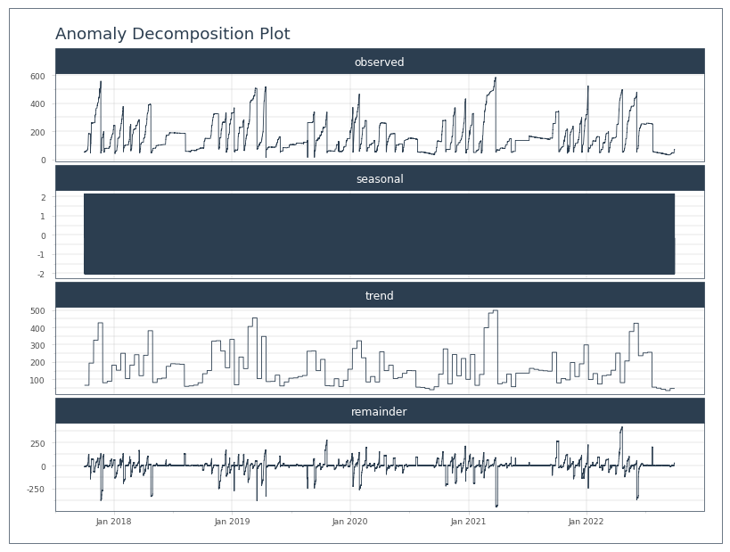
Well, it latched on to the correct seasonal frequency, 288 observations, or 1 day. However, its plot won’t allow any sort of zooming, so it’s not super useful. I’ll have to bang away at this manually to figure out if it’s gonna work for this purpose.
[17]:
anomolize_df
[17]:
| Date | observed | seasonal | seasadj | trend | remainder | anomaly | anomaly_score | anomaly_direction | recomposed_l1 | recomposed_l2 | observed_clean | |
|---|---|---|---|---|---|---|---|---|---|---|---|---|
| 0 | 2017-10-01 00:00:00 | 49.290001 | -0.139478 | 49.429479 | 64.655429 | -15.225950 | No | 20.841694 | 0 | 36.100856 | 104.162535 | 49.290001 |
| 1 | 2017-10-01 00:05:00 | 49.619999 | -0.069749 | 49.689748 | 64.655429 | -14.965681 | No | 20.581426 | 0 | 36.170585 | 104.232264 | 49.619999 |
| 2 | 2017-10-01 00:10:00 | 49.619999 | -0.039445 | 49.659444 | 64.655429 | -14.995985 | No | 20.611730 | 0 | 36.200889 | 104.262568 | 49.619999 |
| 3 | 2017-10-01 00:15:00 | 49.619999 | -0.023484 | 49.643483 | 64.655429 | -15.011946 | No | 20.627691 | 0 | 36.216851 | 104.278529 | 49.619999 |
| 4 | 2017-10-01 00:20:00 | 49.939999 | 0.001212 | 49.938786 | 64.655429 | -14.716643 | No | 20.332388 | 0 | 36.241547 | 104.303225 | 49.939999 |
| ... | ... | ... | ... | ... | ... | ... | ... | ... | ... | ... | ... | ... |
| 525883 | 2022-09-30 23:35:00 | 71.559998 | -0.245696 | 71.805694 | 46.032193 | 25.773501 | No | 20.157756 | 0 | 17.371403 | 85.433081 | 71.559998 |
| 525884 | 2022-09-30 23:40:00 | 71.559998 | -0.228863 | 71.788861 | 46.032193 | 25.756668 | No | 20.140923 | 0 | 17.388236 | 85.449914 | 71.559998 |
| 525885 | 2022-09-30 23:45:00 | 71.500000 | -0.204489 | 71.704489 | 46.032193 | 25.672296 | No | 20.056551 | 0 | 17.412610 | 85.474289 | 71.500000 |
| 525886 | 2022-09-30 23:50:00 | 71.550003 | -0.184846 | 71.734849 | 46.032193 | 25.702656 | No | 20.086911 | 0 | 17.432253 | 85.493932 | 71.550003 |
| 525887 | 2022-09-30 23:55:00 | 71.470001 | -0.164382 | 71.634383 | 46.032193 | 25.602190 | No | 19.986445 | 0 | 17.452717 | 85.514396 | 71.470001 |
525888 rows × 12 columns
[18]:
anom_df = anomolize_df.set_index('Date')
anom_df['Date'] = anom_df.index
[19]:
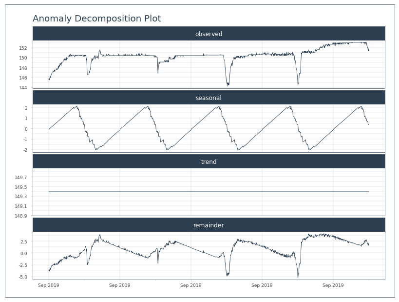
strt, end = pd.to_datetime('9/23/2019'), pd.to_datetime('9/27/2019 1200')
[20]:
test = anom_df[strt:end]
test.plot_anomalies_decomp('Date', engine='matplotlib')
[20]:
[21]:
test
[21]:
| observed | seasonal | seasadj | trend | remainder | anomaly | anomaly_score | anomaly_direction | recomposed_l1 | recomposed_l2 | observed_clean | Date | |
|---|---|---|---|---|---|---|---|---|---|---|---|---|
| Date | ||||||||||||
| 2019-09-23 00:00:00 | 145.500000 | -0.139478 | 145.639478 | 149.389054 | -3.749575 | No | 9.365320 | 0 | 120.834481 | 188.896160 | 145.500000 | 2019-09-23 00:00:00 |
| 2019-09-23 00:05:00 | 145.899994 | -0.069749 | 145.969743 | 149.389054 | -3.419311 | No | 9.035055 | 0 | 120.904210 | 188.965889 | 145.899994 | 2019-09-23 00:05:00 |
| 2019-09-23 00:10:00 | 145.500000 | -0.039445 | 145.539445 | 149.389054 | -3.849608 | No | 9.465353 | 0 | 120.934514 | 188.996193 | 145.500000 | 2019-09-23 00:10:00 |
| 2019-09-23 00:15:00 | 145.500000 | -0.023484 | 145.523484 | 149.389054 | -3.865570 | No | 9.481315 | 0 | 120.950476 | 189.012154 | 145.500000 | 2019-09-23 00:15:00 |
| 2019-09-23 00:20:00 | 145.899994 | 0.001212 | 145.898782 | 149.389054 | -3.490272 | No | 9.106017 | 0 | 120.975172 | 189.036850 | 145.899994 | 2019-09-23 00:20:00 |
| ... | ... | ... | ... | ... | ... | ... | ... | ... | ... | ... | ... | ... |
| 2019-09-27 11:40:00 | 151.800003 | 0.621742 | 151.178261 | 149.389054 | 1.789207 | No | 3.826538 | 0 | 121.595702 | 189.657380 | 151.800003 | 2019-09-27 11:40:00 |
| 2019-09-27 11:45:00 | 151.399994 | 0.388138 | 151.011856 | 149.389054 | 1.622802 | No | 3.992942 | 0 | 121.362097 | 189.423776 | 151.399994 | 2019-09-27 11:45:00 |
| 2019-09-27 11:50:00 | 151.800003 | 0.360464 | 151.439539 | 149.389054 | 2.050486 | No | 3.565259 | 0 | 121.334423 | 189.396102 | 151.800003 | 2019-09-27 11:50:00 |
| 2019-09-27 11:55:00 | 151.399994 | 0.376459 | 151.023535 | 149.389054 | 1.634481 | No | 3.981264 | 0 | 121.350418 | 189.412097 | 151.399994 | 2019-09-27 11:55:00 |
| 2019-09-27 12:00:00 | 151.399994 | 0.388164 | 151.011830 | 149.389054 | 1.622776 | No | 3.992969 | 0 | 121.362123 | 189.423802 | 151.399994 | 2019-09-27 12:00:00 |
1297 rows × 12 columns
Well, that seems to capture the drops. But how to use that to adjust the precipitation. Let’s try adjusting the precip, but only where the seasonal adjustment is negative.
[22]:
test.index = df.loc[strt:end, 'TOT'].index

seas_drop = test.seasonal < 0
adj_acc = df.loc[strt:end, 'ACC'] + test.seasonal[seas_drop]
[23]:
plt.figure()
df.loc[strt:end, 'ACC'].plot(grid=True, legend=True)
adj_acc.plot(grid=True, legend=True)
[23]:
<Axes: xlabel='Date'>
Maybe a better starting point is to see how the adjusted tank levels look, since that is what was assessed.
[24]:
plt.figure()
df.loc[strt:end, 'INST'].plot(grid=True, legend=True)
test.seasadj.plot(grid=True, legend=True)
[24]:
<Axes: xlabel='Date'>
Well that looks ridiculous. The seasonality seems to mostly try and even out the up with the down by dropping earlier and continuing the rise later. I can’t see how to apply that.
Maybe the differential of the seasonal would be more appropriate; i.e. whenever the seasonal is dropping, subtract it.
[25]:
seas_slope = test.seasonal.diff()

seas_drop = seas_slope < 0
adj_acc = df.loc[strt:end, 'ACC'] + seas_slope[seas_drop]
[26]:
#plt.close(8)
[27]:
plt.figure()
seas_slope.plot(grid=True, legend=True)
[27]:
<Axes: xlabel='Date'>
[28]:
plt.figure()
df.loc[strt:end, 'ACC'].plot(grid=True, legend=True)
adj_acc.plot(grid=True, legend=True)
[28]:
<Axes: xlabel='Date'>
The seasonal values just seem way too small to do anything. 0.1mm does not make a dent in a 5mm raise.
Plus, the seasonality seems to just smooth the issue over a longer period. Add to that that the remainder still has drops in it. I don’t think we’re getting there with this.
Maybe it will work better by trying to capture the seasonality directly in the precip (TOT).
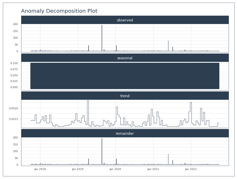
Precip Anomalies
[29]:
# tk doesn't accept pyarrow
tkdf = pd.DataFrame()
tkdf['TOT'] = df.loc[:,'TOT'].astype('float').ffill(axis=0)
tkdf.reset_index(inplace=True)
tkdf['Date'] = tkdf['Date'].astype('datetime64[s]')
[30]:
anomolize_df = tk.anomalize(data=tkdf,
                            value_column='TOT',
                            date_column='Date',
                            method='twitter',
                            verbose=True)
Using seasonal frequency of 288 observations
Using trend frequency of 4032 observations
[31]:
anomolize_df.plot_anomalies_decomp('Date', engine='matplotlib')
[31]:
[32]:
anom_df = anomolize_df.set_index('Date')
anom_df['Date'] = anom_df.index
[33]:
test = anom_df[strt:end]
test.plot_anomalies_decomp('Date', engine='matplotlib')
[33]:
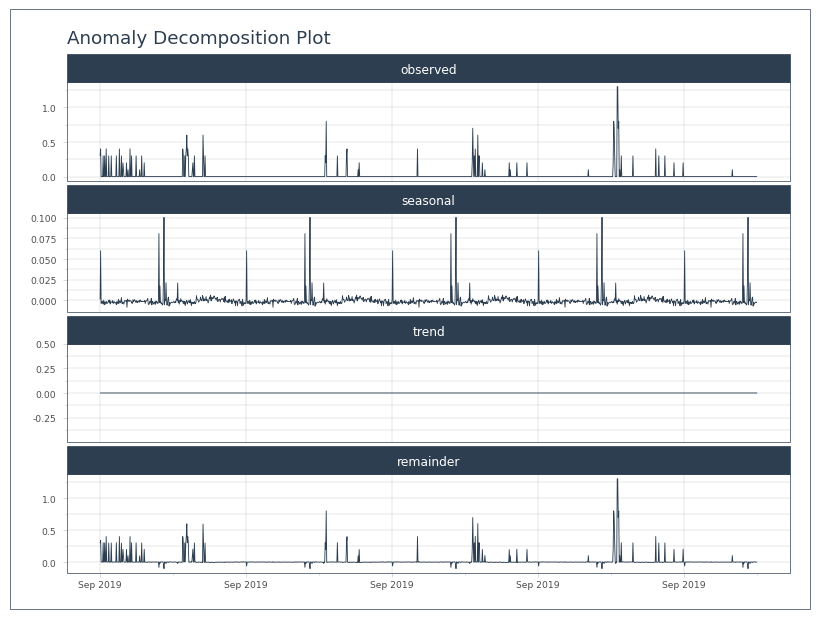
[34]:
test
[34]:
| observed | seasonal | seasadj | trend | remainder | anomaly | anomaly_score | anomaly_direction | recomposed_l1 | recomposed_l2 | observed_clean | Date | |
|---|---|---|---|---|---|---|---|---|---|---|---|---|
| Date | ||||||||||||
| 2019-09-23 00:00:00 | 0.3 | 0.001055 | 0.298945 | 0.001381 | 0.297564 | Yes | 0.295879 | 1 | -0.006175 | 0.014416 | 0.011842 | 2019-09-23 00:00:00 |
| 2019-09-23 00:05:00 | 0.4 | 0.060135 | 0.339865 | 0.001381 | 0.338484 | Yes | 0.336799 | 1 | 0.052905 | 0.073496 | 0.070922 | 2019-09-23 00:05:00 |
| 2019-09-23 00:10:00 | 0.0 | -0.003649 | 0.003649 | 0.001381 | 0.002268 | No | 0.000584 | 0 | -0.010879 | 0.009711 | 0.000000 | 2019-09-23 00:10:00 |
| 2019-09-23 00:15:00 | 0.0 | -0.001984 | 0.001984 | 0.001381 | 0.000603 | No | 0.001081 | 0 | -0.009214 | 0.011376 | 0.000000 | 2019-09-23 00:15:00 |
| 2019-09-23 00:20:00 | 0.0 | -0.000916 | 0.000916 | 0.001381 | -0.000465 | No | 0.002149 | 0 | -0.008146 | 0.012444 | 0.000000 | 2019-09-23 00:20:00 |
| ... | ... | ... | ... | ... | ... | ... | ... | ... | ... | ... | ... | ... |
| 2019-09-27 11:40:00 | 0.0 | -0.002436 | 0.002436 | 0.001381 | 0.001055 | No | 0.000629 | 0 | -0.009666 | 0.010924 | 0.000000 | 2019-09-27 11:40:00 |
| 2019-09-27 11:45:00 | 0.0 | -0.002047 | 0.002047 | 0.001381 | 0.000666 | No | 0.001018 | 0 | -0.009277 | 0.011313 | 0.000000 | 2019-09-27 11:45:00 |
| 2019-09-27 11:50:00 | 0.0 | -0.002847 | 0.002847 | 0.001381 | 0.001466 | No | 0.000219 | 0 | -0.010076 | 0.010514 | 0.000000 | 2019-09-27 11:50:00 |
| 2019-09-27 11:55:00 | 0.0 | -0.002157 | 0.002157 | 0.001381 | 0.000776 | No | 0.000909 | 0 | -0.009386 | 0.011204 | 0.000000 | 2019-09-27 11:55:00 |
| 2019-09-27 12:00:00 | 0.0 | -0.002157 | 0.002157 | 0.001381 | 0.000776 | No | 0.000909 | 0 | -0.009386 | 0.011204 | 0.000000 | 2019-09-27 12:00:00 |
1297 rows × 12 columns
[35]:
plt.figure()
df.loc[strt:end, 'TOT'].cumsum().plot(grid=True, legend=True)

new_acc = test.seasadj.cumsum()
new_acc.plot(grid=True, legend=True)
[35]:
<Axes: xlabel='Date'>
[36]:
#plt.close(7)
It looks like the seasonally adjusted precip never actually goes to 0. It always has some small number. They’re also very small…
Let’s try this again, but only adjust where there was some precipitation to adjust.
[37]:
test.describe()
[37]:
| observed | seasonal | seasadj | trend | remainder | anomaly_score | anomaly_direction | recomposed_l1 | recomposed_l2 | observed_clean | Date | |
|---|---|---|---|---|---|---|---|---|---|---|---|
| count | 1297.000000 | 1297.000000 | 1297.000000 | 1.297000e+03 | 1297.000000 | 1297.000000 | 1297.000000 | 1297.000000 | 1297.000000 | 1297.000000 | 1297 |
| mean | 0.020123 | 0.000033 | 0.020090 | 1.381127e-03 | 0.018709 | 0.023456 | 0.033153 | -0.007196 | 0.013394 | 0.001696 | 2019-09-25 06:00:00 |
| min | 0.000000 | -0.008284 | -0.100592 | 1.381127e-03 | -0.101973 | 0.000030 | -1.000000 | -0.015513 | 0.005077 | 0.000000 | 2019-09-23 00:00:00 |
| 25% | 0.000000 | -0.002808 | -0.000049 | 1.381127e-03 | -0.001430 | 0.001018 | 0.000000 | -0.010038 | 0.010552 | 0.000000 | 2019-09-24 03:00:00 |
| 50% | 0.000000 | -0.001191 | 0.001381 | 1.381127e-03 | 0.000000 | 0.002149 | 0.000000 | -0.008421 | 0.012170 | 0.000000 | 2019-09-25 06:00:00 |
| 75% | 0.000000 | 0.000226 | 0.003192 | 1.381127e-03 | 0.001811 | 0.003982 | 0.000000 | -0.007004 | 0.013587 | 0.000000 | 2019-09-26 09:00:00 |
| max | 1.300000 | 0.100592 | 1.304534 | 1.381127e-03 | 1.303153 | 1.301469 | 1.000000 | 0.093362 | 0.113952 | 0.095936 | 2019-09-27 12:00:00 |
| std | 0.097992 | 0.009635 | 0.098512 | 2.104164e-17 | 0.098512 | 0.097180 | 0.288106 | 0.009635 | 0.009635 | 0.008865 | NaN |
[38]:
strt_val = df.loc[strt:end, 'ACC']
new_acc = test.observed.cumsum()

raining = test.observed>0

new_acc[raining] -= test.seasonal[raining]
[39]:
#plt.close(9)
[40]:
new_acc
[40]:
Date
2019-09-23 00:00:00     0.298945
2019-09-23 00:05:00     0.639865
2019-09-23 00:10:00     0.700000
2019-09-23 00:15:00     0.700000
2019-09-23 00:20:00     0.700000
                         ...
2019-09-27 11:40:00    26.100000
2019-09-27 11:45:00    26.100000
2019-09-27 11:50:00    26.100000
2019-09-27 11:55:00    26.100000
2019-09-27 12:00:00    26.100000
Name: observed, Length: 1297, dtype: float64
We still end up with the same total here. So not much “removal”. The values from this process are simply too small to make a meaningful impact, and they smooth the signal rather than removing it. There just don’t seem to be many knobs to tweak with PyTimeTK. Altogether, PyTimeTK anomaly detection doesn’t seem to be a viable method for removing this diurnal pattern.
StatsModels Signal Decomposition
Let’s try a different signal decomposition strategy. Statsmodels has a built in decomposition.
Decomposing Tank Height
[41]:
from statsmodels.tsa.seasonal import seasonal_decompose
[42]:
test = df.loc[strt:end,'INST']
test.index = test.index.astype('datetime64[s]')
test.index.freq = '5min'
[43]:
# stats model needs freq defined in the index and doesn't seem to play well with arrow datetime
test.index
[43]:
DatetimeIndex(['2019-09-23 00:00:00', '2019-09-23 00:05:00',
               '2019-09-23 00:10:00', '2019-09-23 00:15:00',
               '2019-09-23 00:20:00', '2019-09-23 00:25:00',
               '2019-09-23 00:30:00', '2019-09-23 00:35:00',
               '2019-09-23 00:40:00', '2019-09-23 00:45:00',
               ...
               '2019-09-27 11:15:00', '2019-09-27 11:20:00',
               '2019-09-27 11:25:00', '2019-09-27 11:30:00',
               '2019-09-27 11:35:00', '2019-09-27 11:40:00',
               '2019-09-27 11:45:00', '2019-09-27 11:50:00',
               '2019-09-27 11:55:00', '2019-09-27 12:00:00'],
              dtype='datetime64[s]', name='Date', length=1297, freq='5min')
[44]:
decomposition = seasonal_decompose(test, period=288, model='additive')
trend = decomposition.trend
seasonal = decomposition.seasonal
residual = decomposition.resid

plt.figure()
ax1 = plt.subplot(211)
test.plot(legend=True, label='Original')
trend.plot(grid=True, legend=True, label='Trend')
ax2 = plt.subplot(212)
seasonal.plot(grid=True, legend=True, label='Seasonal')
residual.plot(grid=True, legend=True, label='Residual')
[44]:
<Axes: xlabel='Date'>
[45]:
#plt.close(12)
That’s a good first pass. The trend and seasonal look good, however, the residuals caught a lot of the change in amplitude. So the residuals are inflated. Let’s see what they look like in combination.
[46]:
plt.figure()
plt.subplot(211)
(residual + seasonal).plot(grid=True, legend=True, label='Seasonal + Residual')
[46]:
<Axes: xlabel='Date'>
[47]:
plt.subplot(212)
df.loc[strt:end,'TOT'].cumsum().plot(grid=True, legend=True, label='Precip accum')
[47]:
<Axes: xlabel='Date'>
[48]:
#plt.close(13)
The combined residuals and seasonal decomposition looks perfect. Basically, only the trend is correct. The question, then, is how to subtract the precipitation during that period.
abs(tank - trend) > N, precip = 0
abs(residuals + seasonal) < 2xprecision, precip = 0
try decomposing ACC
Could apply these 0 periods and then do a daily based pro-rating after these periods are zeroed out.
This could prove to be a risky strategy in the broader dataset. There could be many moments where precipitation doesn’t match very precisely to the tank trend, and is different enough to trigger the criteria above. Or moments where simple_pre.m ignored the tank changes as noise instead of precipitation, and therefore an assessment of tank change could be large enough to be substantially different from precipitation.
Decomposing ACC
[49]:
test = df.loc[strt:end,'ACC']
test.index = test.index.astype('datetime64[s]')
test.index.freq = '5min'
[50]:
decomposition = seasonal_decompose(test, period=288, model='additive')
trend = decomposition.trend
seasonal = decomposition.seasonal
residual = decomposition.resid

plt.figure()
ax1 = plt.subplot(211)
test.plot(legend=True, label='Original')
trend.plot(grid=True, legend=True, label='Trend')
ax2 = plt.subplot(212)
seasonal.plot(grid=True, legend=True, label='Seasonal')
residual.plot(grid=True, legend=True, label='Residual')
[50]:
<Axes: xlabel='Date'>
[51]:
plt.figure()
plt.subplot(211)
(seasonal+residual).plot(grid=True, legend=True, label='Seasonal+Residual')
plt.subplot(212)
non_trend = abs(seasonal+residual)
(test-non_trend).plot(grid=True, legend=True, label='ACC-(seasonal+residual)')
[51]:
<Axes: xlabel='Date'>
[52]:
#plt.close(15)
That looks very ineffective. It’s identifying that the trend cuts through the peak accumulation and the flatline of zero precip. So instead of getting a residual or seasonality of a mid-day spike in accumulation, it sees both the spike and the flatline as divergence from the trend. This effectively smooths out the accumulation rate by subtracting some of the early precip and adding it back later.
Selecting PPT from Seasonal Tank Height
So, for this to be useful, it will need to identify times when the cycle/seasonal-pattern is occurring and then subtract precipitation during those time periods. Since the precise magnitude of the pattern doesn’t matter, just the trend, then maybe the residuals aren’t important. Let’s take a closer look at how the seasonal pattern lines up.
[53]:
# make a new decomposition with tank height
test = df.loc[strt:end,'INST']
test.index = test.index.astype('datetime64[s]')
test.index.freq = '5min'

decomposition = seasonal_decompose(test, period=288, model='additive')
trend = decomposition.trend
seasonal = decomposition.seasonal
residual = decomposition.resid
[54]:
#plt.close(15)
[55]:
plt.figure()
ax1 = test.plot(legend=True, label='Original')
ax2 = ax1.twinx()
seasonal.plot(grid=True, legend=True, label='Seasonal', ax=ax2, color='orange')
[55]:
<Axes: xlabel='Date'>
[56]:
#plt.close(18)
[57]:
precision = 0.288
[58]:
is_oscilating = abs(seasonal) > (3* precision)
increase = seasonal.diff() > 0

false_increase = is_oscilating & increase

test[false_increase].plot(grid=True, legend=True, label='False Precip', linestyle='', marker='d', ax=ax1)
test.plot(grid=True, legend=True, label='Precip', linestyle='', marker='.', ax=ax1)
[58]:
<Axes: xlabel='Date'>
The jaggedness of the seasonal line is leading to non-increasing precipitation. Basically, it’s missing some. Let’s try without the increasing requirement.
[59]:
plt.figure()
ax1 = test.plot(legend=True, label='Original', marker='.')
ax2 = ax1.twinx()
seasonal.plot(grid=True, legend=True, label='Seasonal', ax=ax2, color='orange')
test.loc[is_oscilating].plot(grid=True, legend=True, label='False Precip', linestyle='', marker='d', ax=ax1)
[59]:
<Axes: xlabel='Date'>
[60]:
df.loc[strt:end,'TOT'].sum()
[60]:
26.100000455975533
[ ]:
[61]:
test = df.loc[strt:end,['INST','TOT']]
test.index = test.index.astype('datetime64[s]')
test.loc[~is_oscilating, 'TOT'].sum()
[61]:
15.40000044554472
That’s not bad. I think the real number should be more like 7 mm. The seasonal response could be a lot smoother, and the wavelength could line up better. In the last two days of our test period the seasonal signal last longer than the real signal, and the seasonal signal ends short in the first two days. Plus, the timestamp conversion is pretty annoying. I’m also not sure how to cut those last three mm off the total. Let’s try residual + seasonal, but this doesn’t seem to be going in the right direction.
[62]:
#plt.close(17)
[63]:
is_oscilating = abs(seasonal+residual) > (3* precision)
[ ]:
[64]:
plt.figure()
ax1 = test.INST.plot(legend=True, label='Original', marker='.')
ax2 = ax1.twinx()
(seasonal+residual).plot(grid=True, legend=True, label='Seasonal', ax=ax2, color='orange')
test.loc[is_oscilating, 'INST'].plot(grid=True, legend=True, label='False Precip', linestyle='', marker='d', ax=ax1)
test.INST.plot(grid=True, legend=True, label='Precip', linestyle='', marker='.', ax=ax1)
[64]:
<Axes: xlabel='Date'>
That looks better, but it’s capturing a number of moments outside of oscilations that appear to bounce above the 3 precision threshold. These are not the target of this filter and are likely a whole different can of worms. It will be hard to assess the true value of these identified points. Let’s look at the precipitation values at those points in time to see how relevant they might be.
[65]:
#plt.close(20)
[66]:
testppt = df.loc[strt:end,'TOT']
testppt.index = testppt.index.astype('datetime64[s]')
[67]:
plt.figure()
ax1 = test.INST.plot(legend=True, label='Original', marker='.')
ax2 = ax1.twinx()

testppt.plot(grid=True, legend=True, label='Precip', ax=ax2, color='orange')

testppt.loc[is_oscilating].plot(grid=True, legend=True, label='False Precip', linestyle='', marker='d', color='c', ax=ax2)
[67]:
<Axes: xlabel='Date'>
[68]:
plt.figure()
ax1 = test.INST.plot(legend=True, label='Original', marker='.')
ax2 = ax1.twinx()

testppt  = df.loc[strt:end,'TOT']
testppt.index = testppt.index.astype('datetime64[s]')
testppt.plot(grid=True, legend=True, label='Precip', ax=ax2, color='orange')

testppt.loc[is_oscilating].plot(grid=True, legend=True, label='False Precip', linestyle='', marker='d', color='c', ax=ax2)
[68]:
<Axes: xlabel='Date'>
[69]:
#plt.close(20)
#plt.close(21)
[70]:
plt.figure()
ax1 = test.INST.plot(legend=True, label='Original', marker='.')
ax2 = ax1.twinx()

testppt.plot(grid=True, legend=True, label='Precip', ax=ax2, color='orange')

testppt.loc[is_oscilating].plot(grid=True, legend=True, label='False Precip', linestyle='', marker='d', color='c', ax=ax2)
[70]:
<Axes: xlabel='Date'>
There are a number of precipitation totals during the oscilation that aren’t being caught, but then there are some during flat line periods that are being caught. Any precipitation during the near flat tank periods is ambiguous; it’s equally hard to disprove or justify the precipitation. For example, in the second figure on Sep 27 it looks like some real precipitation is being caught accidentally during a gradual increase in tank level. However, in the previous figure on Sep 26, it looks like some tank signal noise is being counted as precipitation. It just looks like too much doesn’t fit here. It seems to come down to minor offsets between the trend and the tank. We might be better off comparing raw tank changes to precipitation.
Filter Midnight to Midnight
Rolling averages did not work well (Rolling Sum of Tank). But looking at daily beginning and ending tank levels could work.
The check could be something like: midnight-midnight change in tank level has to be within n x precision of daily total precipitation. This would then flag the whole day as signal noise. Then, the new total could be inserted and prorated to 5 minutes.
One issue is that this is often highly correlated with temperature, so the daily low tank level is not at midnight, but around dawn. Offsets can be inserted into daily resamples, for example, the data can be resampled daily, with a 5 hour offset, putting the first and last measurement of each day at 0500. But that assumes we can set a morning start time that is good all year and across stations. Another solution would be to try and use the daily minimum tank level instead of a the first/starting tank level. However the use of low values will fail whenever there is a tank drain. For this reason, this approach is avoided below.
I have a bad feeling that this will select a wide range of days that may or may not have the diurnal pattern, since tank levels often down’t match accumlation from the simple_pre.m algorithm in a very straight forward way.
First, let’s see what this looks like with our UPLO SH example from 2019.
[71]:
# get daily tank levels
strt, end = pd.to_datetime('9/23/2019'), pd.to_datetime('9/27/2019 2355')

dly_5am = df.loc[strt:end,'INST'].resample('D', offset='0H')

first_dly = dly_5am.first()
last_dly = dly_5am.last()
dly_max = dly_5am.max()
dly_min = dly_5am.min()
Calculate tank change and daily precipitation and compare them, but put a wide buffer around it.
[72]:
# calculate daily precip from daily tank
dly_chg = last_dly - first_dly

# calculate daily total ppt
dly_ppt = df.loc[strt:end,'TOT'].resample('D', offset='0H').sum()

precision = 0.288
over_accum = (dly_ppt > (dly_chg + 2 * precision))

dly_chg
[72]:
2019-09-23 00:00:00    4.899994
2019-09-24 00:00:00         0.0
2019-09-25 00:00:00    0.200012
2019-09-26 00:00:00    2.099991
2019-09-27 00:00:00    0.599991
Name: INST, dtype: float[pyarrow]
[73]:
dly_ppt
[73]:
2019-09-23 00:00:00    10.6
2019-09-24 00:00:00     2.6
2019-09-25 00:00:00     4.5
2019-09-26 00:00:00     8.3
2019-09-27 00:00:00     0.4
Name: TOT, dtype: float[pyarrow]
That’s a pretty big gap between precipitation and tank changes. Let’s graph it and look at where we are overaccumulating.
[74]:
#plt.close(20)
[75]:
plt.figure()
df.loc[strt:end,'INST'].plot(grid=True, legend=True)
first_dly.plot(marker='.')
last_dly.plot(marker='.')
dly_max.plot(marker='.')
dly_min.plot(grid=True,marker='.')

last_dly[over_accum].plot(marker='*', linestyle='', grid=True)

plt.legend(['INST', 'first dly', 'last dly', 'dly max', 'dly min', 'Over Accumulate'])
[75]:
<matplotlib.legend.Legend at 0x389603730>
That looks promising. It successfully ID’d the bad days. Now we need to make it subtract all of the extra precip somehow.
[76]:
real_ppt = dly_chg > precision

reset_no_rain = over_accum & ~real_ppt

dly_ppt[reset_no_rain] = 0

dly_ppt
[76]:
2019-09-23 00:00:00    10.6
2019-09-24 00:00:00     0.0
2019-09-25 00:00:00     0.0
2019-09-26 00:00:00     8.3
2019-09-27 00:00:00     0.4
Name: TOT, dtype: float[pyarrow]
[77]:
reset_less_rain = over_accum & real_ppt

dly_ppt[reset_less_rain] = dly_chg[reset_less_rain]

dly_ppt
[77]:
2019-09-23 00:00:00    4.899994
2019-09-24 00:00:00         0.0
2019-09-25 00:00:00         0.0
2019-09-26 00:00:00    2.099991
2019-09-27 00:00:00         0.4
Name: TOT, dtype: float[pyarrow]
Let’s rework that a little more cleanly.
[78]:
real_chg = qaqc.QaRules.round_to_precision(dly_chg, precision)
real_chg[real_chg < 2*precision] = 0

dly_ppt[over_accum] = real_chg[over_accum]

dly_ppt
[78]:
2019-09-23 00:00:00    4.896
2019-09-24 00:00:00      0.0
2019-09-25 00:00:00      0.0
2019-09-26 00:00:00    2.016
2019-09-27 00:00:00      0.4
Name: TOT, dtype: float[pyarrow]
Prorating
Now, those corrected totals need to be downsampled and prorated based on these new daily totals… The ticky part is we need the 5 minute resolution as well as the daily at the same time.
[79]:
df['DlyTot'] = dly_ppt
[80]:
df[strt:end]
[80]:
| INST | INST_Flag | TOT | TOT_Flag | ACC | ACC_Flag | DlyTot | |
|---|---|---|---|---|---|---|---|
| Date | |||||||
| 2019-09-23 00:00:00 | 145.5 | <NA> | 0.3 | <NA> | 2858.48999 | <NA> | 4.896 |
| 2019-09-23 00:05:00 | 145.899994 | <NA> | 0.4 | <NA> | 2858.889893 | <NA> | <NA> |
| 2019-09-23 00:10:00 | 145.5 | <NA> | 0.0 | <NA> | 2858.889893 | <NA> | <NA> |
| 2019-09-23 00:15:00 | 145.5 | <NA> | 0.0 | <NA> | 2858.889893 | <NA> | <NA> |
| 2019-09-23 00:20:00 | 145.899994 | <NA> | 0.0 | <NA> | 2858.889893 | <NA> | <NA> |
| ... | ... | ... | ... | ... | ... | ... | ... |
| 2019-09-27 23:35:00 | 153.100006 | <NA> | 0.0 | <NA> | 2884.590088 | <NA> | <NA> |
| 2019-09-27 23:40:00 | 153.399994 | <NA> | 0.0 | <NA> | 2884.590088 | <NA> | <NA> |
| 2019-09-27 23:45:00 | 153.100006 | <NA> | 0.0 | <NA> | 2884.590088 | <NA> | <NA> |
| 2019-09-27 23:50:00 | 153.399994 | <NA> | 0.0 | <NA> | 2884.590088 | <NA> | <NA> |
| 2019-09-27 23:55:00 | 153.399994 | <NA> | 0.0 | <NA> | 2884.590088 | <NA> | <NA> |
1440 rows × 7 columns
Bad idea. Good option for fast joining, even when it requires downsampling, but wrong place to use it. That isn’t really helpful here, if for no other reason then you also need to recalculate the daily sum.
[81]:
dly = df[strt:end].groupby(pd.Grouper(freq='1D'))
[82]:
precision = 0.288

plt.figure()
ax1 = plt.axes()
ax2 = ax1.twinx()
last_acc = 0

for d in dly:
    dlydf = d[1]

    # calculate daily total ppt
    dly_ppt = dlydf['TOT'].sum()
    if dly_ppt <= 0:
        continue

    # get daily tank levels
    first_dly = dlydf['INST'].iloc[0]
    last_dly = dlydf['INST'].iloc[-1]
    # calculate daily precip from daily tank
    dly_chg = last_dly - first_dly

    over_accum = (dly_ppt > (dly_chg + 2 * precision))

    # did it really rain? Exclude drains
    real_chg = qaqc.QaRules.round_to_precision(dly_chg, precision)
    real_ppt = real_chg if real_chg > 2 * precision else 0


    if over_accum and dly_ppt > 0:
        ratio = real_ppt/dly_ppt
        dlydf['TOT'] *= ratio

    new_acc =  dlydf.TOT.cumsum()
    new_acc += last_acc
    last_acc = new_acc.max()

    ax1 = new_acc.plot(grid=True, legend=True, ax=ax1, linestyle=':')
    dlydf.INST.plot(grid=True, legend=True, ax=ax2)
[83]:
#plt.close(11)
Well, that will need some refactoring, but it looks like it worked correctly: the new total is reduced, matches the amount of tank change, and is distributed throughout the day. However, the prorating does have a glaring problem: the precipitation totals are now correct, but the values still occur during the diurnal swing… This is only a problem on days where there is a real change in tank level. For eliminating dry days with false precipitation, this is working fine with this small example.
Good 0 PPT Filter
While the pro-rating was problematic, this was a good filter of days that shouldln’t record any rain. It will need to be tested over a broader range of data, but it makes sense to check that dry days receive no precipitation.
Wavelet Transform
A Fast Fourier transform returns the frequency of oscilations found in our data. A wavelet assigns a time when each frequency occurs by matching a single wave (wavelet) in a sliding window, where windows can overlap.E.g. it can apply a 1 hour window and then apply a 6 hour window. This has strong possibilities of allowing just the signal to be removed, directly removing precip that was the result of oscilation and leaving the precipitation that resulted from actual increases. It also won’t have the trouble of prorating back to the original pattern in smaller amounts.
Picking a Waveform
First, let’s pick a wavelet shape.
[84]:
import pywt
import numpy as np
[85]:
pywt.wavelist(kind='continuous')
[85]:
['cgau1',
 'cgau2',
 'cgau3',
 'cgau4',
 'cgau5',
 'cgau6',
 'cgau7',
 'cgau8',
 'cmor',
 'fbsp',
 'gaus1',
 'gaus2',
 'gaus3',
 'gaus4',
 'gaus5',
 'gaus6',
 'gaus7',
 'gaus8',
 'mexh',
 'morl',
 'shan']
[86]:
def plt_wave_shape (wave_name='bior1.3'):
    try:
        # discrete wavelets
        wavelet = pywt.Wavelet(wave_name)
    except ValueError:
        # continueous wavelet
        wavelet = pywt.ContinuousWavelet(wave_name)

    wfunc = wavelet.wavefun()
    wx = wfunc[-1]
    wy = wfunc[0]
    plt.figure()
    plt.plot(wx, wy)
    plt.title(wave_name)

plt_wave_shape('cgau2')
/opt/homebrew/Caskroom/miniconda/base/envs/datasci/lib/python3.10/site-packages/matplotlib/cbook.py:1709: ComplexWarning: Casting complex values to real discards the imaginary part
/opt/homebrew/Caskroom/miniconda/base/envs/datasci/lib/python3.10/site-packages/matplotlib/cbook.py:1345: ComplexWarning: Casting complex values to real discards the imaginary part
[87]:
plt_wave_shape('cgau6')
[88]:
plt_wave_shape('gaus2')
That looks pretty decent. cgau2 seems to describe our test period. However, we know that often the trend goes in the other direction. gau2 or mexican hat seem like pretty good candidates in the opposite direction.
Continuous Transformation
Each hour there are 12 samples every 5 minutes, so I’ll test at multiples of 12.
[89]:
test = df.loc[strt:end, 'INST']
test = test.astype('float')

# timestep in days
dt = 1/288
# scales to test at
scales = [24, 48, 72, 144, 288, 432, 596]

coef, freq = pywt.cwt(test, scales, 'cgau2', dt)
[90]:
#plt.close(30)
[91]:
1/freq
[91]:
array([0.20833333, 0.41666667, 0.625     , 1.25      , 2.5       ,
       3.75      , 5.17361111])
[92]:
# convert to hours
period = (1/freq)
power = (abs(coef))**2
# time as an array by fractional day
time = np.arange(1, len(test)+1, 1) * dt

fig, ax = plt.subplots()
im = plt.contourf(time, np.log2(period), np.log2(power), extend='both')#, np.log2([1/24, 0.25, 0.5, 1, 2]))

yticks = 2**np.arange(np.ceil(np.log2(period.min())), np.ceil(np.log2(period.max())))
ax.set_yticks(np.log2(yticks))
ax.set_yticklabels(yticks)
ax.invert_yaxis()

plt.xlabel('Day')
plt.ylabel('Period (days)')
[92]:
Text(0, 0.5, 'Period (days)')
[93]:
plt.grid()
[94]:
#for f in range(24,59,1):
#    plt.close(f)
It looks like we probably need to be looking at a bigger test period than just five days, because there appears to be a strong 5 day frequency. I’m also a bit concerned that the timing of our peak frequencies is at midnight…
Let’s try it again but test a larger number of frequencies than that short list.
[95]:
ndays = int(len(test)/288)
scales = range(6,len(test)+1,1)

coef, freq = pywt.cwt(test, scales, 'cgau2', dt)
[96]:
coef
[96]:
array([[ 3.20884622e-01 -100.57756294j, -4.79396118e+01  -91.12864198j,
        -8.56661823e+01  -65.6299405j , ...,
        -1.11963649e+02  +33.21778756j, -9.06419187e+01  +69.15990611j,
        -5.08841482e+01  +96.05701115j],
       [ 4.55670734e-01 -108.61851141j, -4.59285891e+01 -100.6514966j ,
        -8.21667071e+01  -80.41005655j, ...,
        -1.14136747e+02  +52.41137987j, -8.70981109e+01  +84.73783288j,
        -4.89118173e+01 +106.11805178j],
       [ 6.02185007e-01 -116.1191306j , -4.26953995e+01 -109.71742892j,
        -8.03523973e+01  -91.55862213j, ...,
        -1.12589794e+02  +70.67494573j, -8.53614216e+01  +96.47757483j,
        -4.56506948e+01 +115.67216065j],
       ...,
       [-1.13106506e+03-2287.66064559j, -1.13152570e+03-2288.4438605j ,
        -1.13218877e+03-2288.19551825j, ...,
        -1.16448542e+03+2286.57653136j, -1.16454605e+03+2286.51081659j,
        -1.16487513e+03+2286.56834614j],
       [-1.13152096e+03-2288.70059009j, -1.13232430e+03-2289.12397871j,
        -1.13246552e+03-2289.36762658j, ...,
        -1.16538928e+03+2287.65678018j, -1.16501684e+03+2287.60946175j,
        -1.16537366e+03+2287.4466712j ],
       [-1.13204303e+03-2289.7175627j , -1.13251674e+03-2290.00281433j,
        -1.13273082e+03-2290.1832904j , ...,
        -1.16560548e+03+2288.05260983j, -1.16536195e+03+2288.07866999j,
        -1.16588811e+03+2288.41301679j]])
[97]:
# convert to hours
period = (1/freq)
power = (abs(coef))**2

fig, ax = plt.subplots()
im = plt.contourf(time, np.log2(period), np.log2(power), extend='both')#, np.log2([1/24, 0.25, 0.5, 1, 2]))

yticks = 2**np.arange(np.ceil(np.log2(period.min())), np.ceil(np.log2(period.max())))
ax.set_yticks(np.log2(yticks))
ax.set_yticklabels(yticks)
ax.invert_yaxis()

plt.xlabel('Day')
plt.ylabel('Period (days)')
[97]:
Text(0, 0.5, 'Period (days)')
[98]:
plt.grid()
That got rid of the multi-day pattern, but the greatest alignment is still at midnight, not during the peak each day. Plus, that really took a while to run on just 5 days. I’m missing something. Let’s check the frequency data and see if the frequencies are correct.
Let’s take a peak at what a fast fourier transformation says the frequency should be. I’ll use the trend line from statsmodel above to detrend the data so the signal can be analyzed.
[99]:
import scipy.fft
[100]:
#plt.close(46)
[101]:
detrend = test - trend
fft_y_i = scipy.fft.fft(detrend.dropna())
# remove imaginary numbers and the negative mirror image of the transformation
pos_half = len(fft_y_i)//2
fft_y_real = abs(fft_y_i[:pos_half])

fft_x_i = scipy.fft.fftfreq(len(detrend))
fft_x_real = fft_x_i[:pos_half]
fft_time = 1/fft_x_real/288*24

plt.figure()
plt.subplot(211)
plt.plot(fft_x_real, fft_y_real)


plt.grid('on')
plt.xlabel('frequency = 1/T')

plt.subplot(212)
plt.plot(fft_time, fft_y_real)

plt.grid('on')
plt.semilogx()
xticks = [ 1, 2, 4, 6, 10, 15, 30 ]
ax = plt.gca()
ax.set_xticks(xticks)
_ = ax.set_xticklabels(xticks)
plt.xlabel('frequency in hours')
[101]:
Text(0.5, 0, 'frequency in hours')
The FFT shows a little longer frequencies than I would have thought from the scaleogram. In fact, the scaleogram barely gets to daily: it’s mostly around 3-6 hours. Which seems to be how long the spikes last. So seeing a maximum occurrence of a 30 hour frequency is surprising. Let’s take another look at the frequencies output from the CWT.
[102]:
for i, p in enumerate(period):
    if i > 15:
        break
    print(p)
0.052083333333333336
0.06076388888888888
0.06944444444444443
0.078125
0.08680555555555554
0.09548611111111109
0.10416666666666667
0.11284722222222221
0.12152777777777776
0.13020833333333331
0.13888888888888887
0.14756944444444445
0.15625
0.16493055555555555
0.17361111111111108
0.18229166666666663
[103]:
np.shape(coef)
[103]:
(1435, 1440)
That breaks down into really little bits. No wonder it took so long to run. Let’s try this another way. I’ll try using the discrete form of the method instead of the continuous form.
Discrete Transformation
This should output a much more manageable list of coefficients and should be more scalable to the larger dataset because it runs way faster.
Unfortunately, we need to find a new waveform.
[104]:
pywt.wavelist(kind='discrete')
[104]:
['bior1.1',
 'bior1.3',
 'bior1.5',
 'bior2.2',
 'bior2.4',
 'bior2.6',
 'bior2.8',
 'bior3.1',
 'bior3.3',
 'bior3.5',
 'bior3.7',
 'bior3.9',
 'bior4.4',
 'bior5.5',
 'bior6.8',
 'coif1',
 'coif2',
 'coif3',
 'coif4',
 'coif5',
 'coif6',
 'coif7',
 'coif8',
 'coif9',
 'coif10',
 'coif11',
 'coif12',
 'coif13',
 'coif14',
 'coif15',
 'coif16',
 'coif17',
 'db1',
 'db2',
 'db3',
 'db4',
 'db5',
 'db6',
 'db7',
 'db8',
 'db9',
 'db10',
 'db11',
 'db12',
 'db13',
 'db14',
 'db15',
 'db16',
 'db17',
 'db18',
 'db19',
 'db20',
 'db21',
 'db22',
 'db23',
 'db24',
 'db25',
 'db26',
 'db27',
 'db28',
 'db29',
 'db30',
 'db31',
 'db32',
 'db33',
 'db34',
 'db35',
 'db36',
 'db37',
 'db38',
 'dmey',
 'haar',
 'rbio1.1',
 'rbio1.3',
 'rbio1.5',
 'rbio2.2',
 'rbio2.4',
 'rbio2.6',
 'rbio2.8',
 'rbio3.1',
 'rbio3.3',
 'rbio3.5',
 'rbio3.7',
 'rbio3.9',
 'rbio4.4',
 'rbio5.5',
 'rbio6.8',
 'sym2',
 'sym3',
 'sym4',
 'sym5',
 'sym6',
 'sym7',
 'sym8',
 'sym9',
 'sym10',
 'sym11',
 'sym12',
 'sym13',
 'sym14',
 'sym15',
 'sym16',
 'sym17',
 'sym18',
 'sym19',
 'sym20']
[105]:
plt_wave_shape('rbio3.3')
[106]:
plt_wave_shape('coif6')
After a bunch of testing, rbio3.3 is by far the best when the oscilation is positive. Unfortunately, there aren’t any discrete wavelets that go negative well.
First, let’s run a DWT at every level of reduction and see what the coefficients look like for each level. Since each level cuts the number of samples in half, I’ll have to figure out how to scale it to some sort of usable timeframe.
[107]:
plt_wave_shape('coif1')
[108]:
#plt.close(40)
plt_wave_shape('rbio1.3')
There doesn’t seem to be any negative waveform that can be used with the DWT. We’ll transition to a different test period with positive oscillations to see if this works any better.
New Test Dataset
[109]:
#plt.close(33)
[ ]:
[164]:
strt, end = pd.to_datetime('4/17/2019'), pd.to_datetime('5/13/2019')

test = var_flags['VAR_02'].data.loc[strt:end, 'tank_height']
test = test.astype('float')
plt.figure()
test.plot(grid=True)
[164]:
<Axes: xlabel='Date'>
[165]:
coeffs = pywt.wavedec(test, 'rbio3.3', mode='periodization')
[112]:
#plt.close(34)
[166]:
# figure out the original time range and make sure time works with division.
len_t = end - strt
len_t/16
[166]:
Timedelta('1 days 15:00:00')
[114]:
#len(coef) != len(band_t)
[ ]:
[167]:
len(coeffs)
[167]:
11
[168]:
plt.figure()
nplots = len(coeffs)

for plotn, coef in enumerate(coeffs):
    # figure out the frequency for this level of decomposition
    len_band = len(coef)
    band_freq = len_t/len_band
    # create a new timeseries with that frequency
    band_t = pd.date_range(start=strt, end=end, freq=band_freq, inclusive='neither')
    if len(coef) != len(band_t):
        band_t = pd.date_range(start=strt, end=end, freq=band_freq, inclusive='left')

    plt.subplot(nplots,1,plotn+1)
    plt.plot(band_t, coef, label=f'{band_freq}')
    plt.grid()
    plt.legend()

#plt.tight_layout()
[117]:
plt.tight_layout()
In the first attempt using the original UPLO test set, the levels got down to 16 samples (the minimum) before it even got to a day. We know from the Fast Fourier Transformation, that the biggest single frequency in this data is at ~30 hours, so we know that test set was missing key data. This wasn’t a problem with a larger dataset. With the whole dataset (5 years), there would still be a lot of data points after currint 500,000 measurements in half 10 times… Something to pay attention to with this method, however.
On the positive side, there is an obvious pattern that emerges around noon each day, assuming I’m getting the time axis correct. That’s what I was hoping to be able to extract. It is a little surprising that the pattern is most evident between 40 min and 2.67 hours. I think switching to periodization helped with that, though with the default symetric-mode the approximation coefficients looked like a fantastic trend line.
I want to look at this data as a scalogram and try to get a better picture of how well it’s working. This will be a little tricky, because, unlike CWT, DWT doesn’t output any frequncies, and each array of coefficients is a different length. Let’s see if I can figure out how to visualize this.
[118]:
# create a single array of coefficients
coeff_array, coeff_slice = pywt.coeffs_to_array(coeffs)
OK, both coeffs_to_array and ravel_coeffs output a single 1D array. A scalogram requires a 2D array for the Z component. I’ll try another attempt to assemble that.
[119]:
def dwt_cnstrct_time(cD, time_index):
    first, last = time_index.min(), time_index.max()
    #len_t = last - first

    len_band = len(cD)
    #band_freq = len_t/len_band

    band_t = pd.date_range(start=first, end=last, periods=len_band)

    return band_t
[120]:
n_levels = len(coeffs[1:])
len_data = len(test)
cD_array = np.empty((n_levels, len_data))
# skip the approximate coefficient and only use the detailed ones
for level, cD in enumerate(coeffs[1:]):
    # assign each level to a dataframe with the and index that spans the same time range, but with changing frequency
    time = dwt_cnstrct_time(cD, test.index)
    cD_df = pd.DataFrame(cD, index=time)
    # resample data to 5 minutes using a forward fill
    cD_df = cD_df.resample('5min').ffill()
    # save the data to the Detail Array
    cD_array[level, :] = cD_df.T

# I just learned I could have done this with pywt.upcoef()
# upcoef would have made a full length set of coefficients.
# However, the levels would need to be counted backwards from 7
# pywt.upcoef('d', coeffs[1], 'rbio3.3', level=7, take=len(test))
#
# reconstructed_details = []
# n_levels = len(coeffs[1:])
# for i, coeff_detail in enumerate(coeffs[1:]):
#    # 'd' for detail, take original length
#    level = n_levels - i
#    detail_full = pywt.upcoef('d',
#                              coeff_detail,
#                              'rbio3.3',
#                              level=level,
#                              take=len(data))
#    reconstructed_details.append(detail_full)
#
# Stack into array: shape = (n_levels, n_time)
#scalogram_data = np.vstack(reconstructed_details)
[121]:
cD_array.shape
[121]:
(10, 7489)
[122]:
test.shape
[122]:
(7489,)
[123]:
len(coeffs[1:])
[123]:
10
[124]:
# get number of levels, ignore approximate coefficients by using cD_array instead of coeffs (which starts with approx. coeffs)
n_level = cD_array.shape[0]
levels = np.arange(1, n_level+1)
# convert to freq. center_freq = freq_sampling / (2** (level+0.5))
freq = 288 / (2**(levels +0.5))
freq
[124]:
array([101.82337649,  50.91168825,  25.45584412,  12.72792206,
         6.36396103,   3.18198052,   1.59099026,   0.79549513,
         0.39774756,   0.19887378])
[125]:
strt - pd.Timedelta('5min')
[125]:
Timestamp('2019-04-16 23:55:00')
[126]:
cD_array.shape[1]
[126]:
7489
[127]:
#plt.close(43)
[128]:
power = cD_array**2
period = (1/freq)

# check that the original data has the same number of timesteps as the rebuilt data
diff_ts = cD_array.shape[1] - len(test)

# pad the timeseries to match the size/shape of the coefficients
first, last = test.index.min(), test.index.max()
# add or subtract an equal number of time steps from either end.
ts = pd.Timedelta('5min')
n_ts = np.ceil(diff_ts/2)

if diff_ts > 0:
    first -= ts * n_ts
    last += ts * n_ts
elif diff_ts <0:
    first += ts * n_ts
    last -= ts * n_ts
# make a clean timeseries using the adjusted start and end times.
time = pd.date_range(start=first, end=last, freq=ts)#np.arange(0, len(test), dt)#

fig, ax = plt.subplots()
#ax = fig.add_subplot(111)
im = ax.contourf(time, np.log2(period), np.log2(power))#, np.log2([1/24, 0.25, 0.5, 1, 2]))

yticks = 2**np.arange(np.ceil(np.log2(period.min())), np.ceil(np.log2(period.max())))
ax.set_yticks(np.log2(yticks))
ax.set_yticklabels(yticks)

plt.xlabel('Day')
plt.ylabel('Period (days)')
[128]:
Text(0, 0.5, 'Period (days)')
[129]:
plt.grid()
This still seems oddly centered around midnight. And there is this big peak at the beginning. Do I need to detrend the data? I only found one example PyCWT that detrends the data. All of the others didn’t. However, detrending is standard in decomposing frequencies with a Fast Fourier. If I need to detrend the data anyways, then I should try and just use the trend line as a basis for what tank data to exclude or include.
Trend Fitting
[130]:
import scipy.signal as sig

test_filter = sig.savgol_filter(test, 288, 1)
[131]:
#plt.close(45)
[132]:
plt.figure()
ax1 = plt.plot(test.values, label='tank height')
plt.plot(test_filter,  label='savgol filter')
plt.grid()
plt.legend()
[132]:
<matplotlib.legend.Legend at 0x38a7ba440>
[133]:
p = np.polyfit(range(1,len(test)+1), test.values, 6)
test_poly = np.polyval(p, range(1,len(test)+1))
[ ]:
[ ]:
[134]:
plt.plot(test_poly, label='polyfit 6')
plt.legend()
[134]:
<matplotlib.legend.Legend at 0x38a847a90>
[135]:
test_detrend = sig.detrend(test)
[136]:
plt.plot(test.values-test_detrend, label='detrend')
plt.legend()
[136]:
<matplotlib.legend.Legend at 0x38a847820>
[137]:
test_med = sig.medfilt(test, kernel_size=289)
plt.plot(test_med, label='med_filter')
plt.legend()
[137]:
<matplotlib.legend.Legend at 0x38a86fca0>
Median Filter
That median filter looks pretty good, let’s take a closer look.
[138]:
strt, end = pd.to_datetime('4/17/2019'), pd.to_datetime('5/13/2019')

test = var_flags['VAR_02'].data.loc[strt:end, 'tank_height']
test_med = sig.medfilt(test, kernel_size=305)
[139]:
plt.figure()
plt.plot(test_med, label='med_filter')
plt.plot(test.values, label='tank height')
plt.grid()
plt.legend()
[139]:
<matplotlib.legend.Legend at 0x38a883610>
[140]:
#plt.close(47)
[141]:
plt.figure()
plt.plot(test.values, label='tank height')
plt.plot(test_med, label='med_filter')
plt.grid()
plt.legend()
[141]:
<matplotlib.legend.Legend at 0x38afb6770>
[142]:
#plt.close(54)
strt, end = pd.to_datetime('9/23/2019'), pd.to_datetime('9/27/2019 2355')
test = df.loc[strt:end, 'INST']

test_med = sig.medfilt(test, kernel_size=289)

plt.figure()
plt.plot(test.values, label='tank height')
plt.plot(test_med, label='med_filter')
plt.grid()
plt.legend()
[142]:
<matplotlib.legend.Legend at 0x38a883cd0>
That looks pretty good except the tail. The image processing module contains a median filter that is suppost to behave identically, but it is faster and has some additional options for how to extend the data. maybe that will allow for a better tail.
[143]:
#plt.close(55)
import scipy

test_med = scipy.ndimage.median_filter(test, size=289, mode='nearest')

plt.figure()
plt.plot(test.values, label='tank height')
plt.plot(test_med, label='med_filter')
plt.grid()
plt.legend()
[143]:
<matplotlib.legend.Legend at 0x38b0477f0>
Well that looks fantastic! Could I just do a rolling median in pandas? Would that effectively be the same as long as I center the rolling window?
[144]:
%%timeit
test_med = test.rolling('1D', center=True).median()
355 μs ± 2.53 μs per loop (mean ± std. dev. of 7 runs, 1,000 loops each)
[145]:
%%timeit
test_med = scipy.ndimage.median_filter(test, size=289, mode='nearest')
59.3 μs ± 1.34 μs per loop (mean ± std. dev. of 7 runs, 10,000 loops each)
[146]:
var_from_trend = test_med - test

#plt.close(56)
plt.figure()
plt.subplot(211)
var_from_trend.plot(grid=True, label='var_from_trend', legend=True)


noise = abs(var_from_trend) > 5*precision

var_from_trend[noise].plot(grid=True, label='false_ppt', legend=True, linestyle='', marker='o')
plt.subplot(212)
test.plot(grid=True, legend=True, label='tank height', marker='o')
test[noise].plot(grid=True, label='false_ppt', legend=True, linestyle='', marker='.')
[146]:
<Axes: xlabel='Date'>
[147]:
plt.figure()
plt.subplot(211)
var_from_trend.plot(grid=True, label='var_from_trend', legend=True)

noise = abs(var_from_trend) > 4*precision

var_from_trend[noise].plot(grid=True, label='false_ppt', legend=True, linestyle='', marker='o')
plt.subplot(212)
test.plot(grid=True, legend=True, label='tank height', marker='o')
test[noise].plot(grid=True, label='false_ppt', legend=True, linestyle='', marker='.')
[147]:
<Axes: xlabel='Date'>
4 x precision (second graph) unfortunately flags the period of peak rainfall as well as the oscillations. When the threshold is increased to 5x (first graph), we no longer have that problem, however it leaves a bit of oscillation… I’ll look at another period and see how the thresholds look.
[148]:
strt, end = pd.to_datetime('4/17/2019'), pd.to_datetime('5/13/2019')
test = var_flags['VAR_02'].data.loc[strt:end, 'tank_height']

test_med = scipy.ndimage.median_filter(test, size=289, mode='nearest')
var_from_trend = test_med - test
noise = abs(var_from_trend) > 5*precision
[149]:
#plt.close(43)
plt.figure()
plt.subplot(211)
var_from_trend.plot(grid=True, label='var_from_trend', legend=True)

var_from_trend[noise].plot(grid=True, label='false_ppt', legend=True, linestyle='', marker='o')
plt.subplot(212)
test.plot(grid=True, legend=True, label='tank height', marker='o')
test[noise].plot(grid=True, label='false_ppt', legend=True, linestyle='', marker='.')
[149]:
<Axes: xlabel='Date'>
Even at 5x precision (~1.4 mm), that catches a little bit of the precip event. This will only be applied to prorating when the daily total has already identified a mismatch. So that precip would only be flagged if the daily total was overaccumulated. So let’s see how that plays out with the bigger function.
Integrate Trend with Midnight Filter
[150]:
dlydf
[150]:
| INST | INST_Flag | TOT | TOT_Flag | ACC | ACC_Flag | DlyTot | |
|---|---|---|---|---|---|---|---|
| Date | |||||||
| 2019-09-27 00:00:00 | 152.800003 | <NA> | 0.0 | <NA> | 2884.189941 | <NA> | 0.4 |
| 2019-09-27 00:05:00 | 153.0 | <NA> | 0.0 | <NA> | 2884.189941 | <NA> | <NA> |
| 2019-09-27 00:10:00 | 152.699997 | <NA> | 0.0 | <NA> | 2884.189941 | <NA> | <NA> |
| 2019-09-27 00:15:00 | 152.399994 | <NA> | 0.0 | <NA> | 2884.189941 | <NA> | <NA> |
| 2019-09-27 00:20:00 | 152.699997 | <NA> | 0.0 | <NA> | 2884.189941 | <NA> | <NA> |
| ... | ... | ... | ... | ... | ... | ... | ... |
| 2019-09-27 23:35:00 | 153.100006 | <NA> | 0.0 | <NA> | 2884.590088 | <NA> | <NA> |
| 2019-09-27 23:40:00 | 153.399994 | <NA> | 0.0 | <NA> | 2884.590088 | <NA> | <NA> |
| 2019-09-27 23:45:00 | 153.100006 | <NA> | 0.0 | <NA> | 2884.590088 | <NA> | <NA> |
| 2019-09-27 23:50:00 | 153.399994 | <NA> | 0.0 | <NA> | 2884.590088 | <NA> | <NA> |
| 2019-09-27 23:55:00 | 153.399994 | <NA> | 0.0 | <NA> | 2884.590088 | <NA> | <NA> |
288 rows × 7 columns
[151]:
#plt.close(44)
[152]:
plt.figure()
ax1 = plt.axes()
ax2 = ax1.twinx()
last_acc = 0

strt, end = pd.to_datetime('4/17/2019'), pd.to_datetime('5/13/2019')
test = var_flags['VAR_02'].data.loc[strt:end, :]

dly = test.groupby(pd.Grouper(freq='1D'))

test_trend = scipy.ndimage.median_filter(test.tank_height, size=289, mode='nearest')
var_from_trend = test_trend - test.tank_height
noise = abs(var_from_trend) > 5*precision

for d in dly:
    dlydf = d[1]

    # calculate daily total ppt
    dly_ppt = dlydf['precip'].sum()
    if dly_ppt <= 0:
        continue

    # get daily tank levels
    first_dly = dlydf['tank_height'].iloc[0]
    last_dly = dlydf['tank_height'].iloc[-1]
    # calculate daily precip from daily tank
    dly_chg = last_dly - first_dly

    # did it really rain? Exclude drains
    real_chg = qaqc.QaRules.round_to_precision(dly_chg, precision)
    real_ppt = real_chg if real_chg > 2 * precision else 0

    over_accum = (dly_ppt > (dly_chg + 2 * precision))

    # remove oscilation
    start = dlydf.index.min()
    end = dlydf.index.max()
    dly_noise = noise.loc[strt:end]
    noiseless_ppt = dlydf.loc[~dly_noise, 'precip'].sum()

    if noiseless_ppt == 0 and real_ppt == 0:
        # avoid divide by 0 error when the numerator is also 0.
        noiseless_ppt = 1

    if over_accum and dly_ppt > 0:
        ratio = real_ppt/noiseless_ppt
        dlydf.loc[~dly_noise, 'precip'] *= ratio
        dlydf.loc[dly_noise, 'precip'] = 0

    new_acc =  dlydf.precip.cumsum()
    new_acc += last_acc
    last_acc = new_acc.max()

    ax1 = new_acc.plot(grid=True, ax=ax1, linestyle='', marker='.')
    dlydf.tank_height.plot(grid=True, ax=ax2)

ax1.set_ylim([-2, 34])
[152]:
(-2.0, 34.0)
[153]:
#for f in range(45,80):
#    plt.close(f)
[154]:
plt.figure()
ax1 = plt.axes()
ax2 = ax1.twinx()
last_acc = 0

strt, end = pd.to_datetime('4/17/2019'), pd.to_datetime('5/13/2019')
test = var_flags['VAR_02'].data.loc[strt:end, :]

dly = test.groupby(pd.Grouper(freq='1D'))

test_trend = scipy.ndimage.median_filter(test.tank_height, size=289, mode='nearest')
var_from_trend = test_trend - test.tank_height
noise = abs(var_from_trend) > 5*precision

for d in dly:
    dlydf = d[1]

    # calculate daily total ppt
    dly_ppt = dlydf['precip'].sum()
    if dly_ppt <= 0:
        continue

    # get daily tank levels
    first_dly = dlydf['tank_height'].iloc[0]
    last_dly = dlydf['tank_height'].iloc[-1]
    # calculate daily precip from daily tank
    dly_chg = last_dly - first_dly

    # did it really rain? Exclude drains
    real_chg = qaqc.QaRules.round_to_precision(dly_chg, precision)
    real_ppt = real_chg if real_chg > 2 * precision else 0

    over_accum = (dly_ppt > (dly_chg + 2 * precision))

    # remove oscilation
    start = dlydf.index.min()
    end = dlydf.index.max()
    dly_noise = noise.loc[strt:end]
    noiseless_ppt = dlydf.loc[~dly_noise, 'precip'].sum()

    if noiseless_ppt == 0 and real_ppt == 0:
        # avoid divide by 0 error when the numerator is also 0.
        noiseless_ppt = 1

    if over_accum and dly_ppt > 0:
        ratio = real_ppt/noiseless_ppt
        dlydf.loc[~dly_noise, 'precip'] *= ratio
        dlydf.loc[dly_noise, 'precip'] = 0

    new_acc =  dlydf.precip.cumsum()
    new_acc += last_acc
    last_acc = new_acc.max()

    ax1 = new_acc.plot(grid=True, ax=ax1, linestyle='', marker='.')
    dlydf.tank_height.plot(grid=True, ax=ax2)

ax1.set_ylim([-2, 34])
[154]:
(-2.0, 34.0)
That looks pretty good, except the “pink” day underaccumulates. Let’s check and make sure that it’s working right.
[155]:
plt.figure()
ax1 = plt.axes()
ax2 = ax1.twinx()
last_acc = 0

strt, end = pd.to_datetime('4/17/2019'), pd.to_datetime('4/23/2019 2355')
test = var_flags['VAR_02'].data.loc[strt:end, :]

dly = test.groupby(pd.Grouper(freq='1D'))

test_trend = scipy.ndimage.median_filter(test.tank_height, size=289, mode='nearest')
var_from_trend = test_trend - test.tank_height
noise = abs(var_from_trend) > 5*precision

for d in dly:
    dlydf = d[1]

    # calculate daily total ppt
    dly_ppt = dlydf['precip'].sum()
    if dly_ppt <= 0:
        continue

    # get daily tank levels
    first_dly = dlydf['tank_height'].iloc[0]
    last_dly = dlydf['tank_height'].iloc[-1]
    # calculate daily precip from daily tank
    dly_chg = last_dly - first_dly

    # did it really rain? Exclude drains
    real_chg = qaqc.QaRules.round_to_precision(dly_chg, precision)
    real_ppt = real_chg if real_chg > 2 * precision else 0

    over_accum = (dly_ppt > (dly_chg + 2 * precision))

    # remove oscilation
    starts = dlydf.index.min()
    ends = dlydf.index.max()
    dly_noise = noise.loc[starts:ends]
    noiseless_ppt = dlydf.loc[~dly_noise, 'precip'].sum()

    if noiseless_ppt == 0 and real_ppt == 0:
        # avoid divide by 0 error when the numerator is also 0.
        noiseless_ppt = 1

    if over_accum and dly_ppt > 0:
        ratio = real_ppt/noiseless_ppt
        dlydf.loc[~dly_noise, 'precip'] *= ratio
        dlydf.loc[dly_noise, 'precip'] = 0

    new_acc =  dlydf.precip.cumsum()
    new_acc += last_acc
    last_acc = new_acc.max()

    ax1 = new_acc.plot(grid=True, ax=ax1, linestyle='', marker='.')
    dlydf.tank_height.plot(grid=True, ax=ax2)
[156]:
over_accum
[156]:
False
[157]:
noiseless_ppt
[157]:
0.7699999902397394
[158]:
dly_ppt
[158]:
0.7699999902397394
[159]:
real_ppt/noiseless_ppt
[159]:
3.3662338089030115
[160]:
real_ppt
[160]:
2.5919999999999996
It didn’t overaccumulate, so there is no adjustment to make. This method is only intended to remove false accumulation from diurnal oscillations, not adjust all values from simple_pre.m. This looks like a case where simple_pre.m is undercounting the precip for some reason.
This will be more thoroughly tested in the next section.